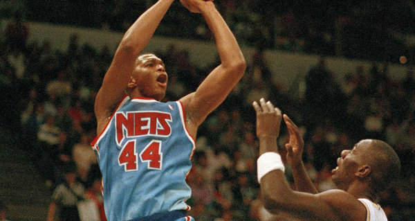
A jersey has always been and is now more than ever a billboard. It’s something athletes wear so they’re less apt to throw the ball to other team, but also representative in hard to pin down ways of a franchise’s identity. There’s something august about the New York Yankees, a dusty baritone rambling about great men, and something august about the pinstripes. The mid-90s Shaq and Penny Magic unis felt young and whimsical in the same way those teams did. There was less thought put into these things in those days, but owners and marketing people and designers have always been thinking about them to some degree or another. Now the NBA lets teams put logos for tech companies and snack foods on the shoulder of the jerseys. They make their billboard a little uglier to create space for another brand.
And so of course when the Toronto Raptors, Memphis Grizzlies, and Utah Jazz all announce that they’re going to be wearing audacious throwback threads at some point during this upcoming season, it’s nothing more than a pitch, but we are also talking aesthetics, and in those terms, the NBA could use more goofy iconography like a dinosaur dribbling a basketball or a wordmark that’s scratched up as if it’s just suffered an encounter with a cartoon bear. At some point in the early aughts, most of the fun went out of uniforms and logos. Everything became either handsome, garishly tough, or blandly refined. I could spend a long time explaining this, or I could just direct you to Alex Siquig’s Bucks tweet.
When the Brooklyn Nets rolled out their plain black-and-white numbers in 2012, they did so with a co-sign from Jay-Z. (Who it turns out has a lot of bad ideas.) This marked the nadir of post-90s tastefulness. These unis, which the Nets have been wearing since hopping over the Hudson, aren’t bad so much as soulless. Anti-style can function as style—see: Repo Man—but as currently kitted out the Nets represent the absence of an idea, some overtired designer smacking his forehead at three in the morning: I’ve got it! What if the cool thing about the uniform was that it doesn’t try to be cool. Mikhail Prokhorov doesn’t know anything about anything and Hov’s an easy mark. That seems like the kind of grandly empty idea that would appeal to both of them.
The Nets have had exactly one great jersey in their 50-plus years of existence: the joints that Dr. J played in back when they were an ABA franchise. The red, white, and blue is classic, the asymmetry makes them interesting. But it bears mentioning, while the NBA is in the thick of a 90s nostalgia phase, that there’s another mothballed number in the Nets’ closet that deserves recognition. In 1990, the franchise moved away from what was essentially a busier and less striking version of the ABA unis. They wanted something more modern, and modern in the George H.W. Bush years meant loud, so they rolled out a WordArted to hell gradient logo and adopted colors that I can only describe as Rocket Pop. These jerseys evoke Dra�en Petrović during his tragically brief prime, Derrick Coleman before terminal laziness brought him down to earth. That, and Saturday morning TV.
And they belong to a narrow aesthetic phylum, landing somewhere between outlandish and stately. The blue is not teal, but it’s not the boring electric shade the Mavericks and Thunder have been wearing for the past decade either. The font is neither a classic script nor a zany roundball cousin of Eraser Dust. It is very 1990, a time which was itself a historical nowhere, appropriate trappings for Nets teams that were terrible for one year, then various forms of just-okay for the next several.
The Rocket Pop aesthetic was abandoned pretty quickly. By 1997, the Nets dulled their colors to navy, silver, and red and started hooping in some truly unremarkable designs that made them look like a team in a movie where the producers couldn’t get the rights to an authentic professional franchise. They had some of their best seasons in these drab duds, after Jason Kidd got traded to the Meadowlands and started scorching through a thin Eastern Conference. It’s entirely possible that the only people nostalgic for the previous era of Nets basketball were about 12 years old when it was happening.
But if Brooklyn were interested in embracing color and revisiting past, this is the time they should throw back to. Or, no, obviously they should choose the Dr. J joints—and on rare occasions, they have—but it would be fitting if the Rocket Pop jerseys made an appearance because it would be about as pure as these cynical exercises get. They draw from no rich well of nostalgia, only a sharply of-its-time uniform worn by a series of good-enough squads, playing where no player really wanted to, teams followed by a bunch of north Jerseyites who were making a half-hearted political statement by not being Knicks fans. The red and blue are aggressive, the bend of the N is a pleasantly strange choice. That’s the beginning and end of it, and in 2019, it is kind of a relief, for a jersey to mean almost nothing. Here are the New Jersey Nets, a basketball concern. What a stupid and blessedly simple concept, exactly the register in which sports should resonate.
More Histories: Atlanta Hawks | Boston Celtics | Brooklyn Nets | Charlotte Hornets | Chicago Bulls | Cleveland Cavaliers | Dallas Mavericks | Denver Nuggets | Detroit Pistons | Houston Rockets | Golden State Warriors | Indiana Pacers | Los Angeles Clippers | Los Angeles Lakers | Memphis Grizzlies | Miami Heat | Milwaukee Bucks | New Orleans Pelicans | New York Knicks | Oklahoma City Thunder | Orlando Magic | Philadelphia 76ers | Phoenix Suns | Portland Trail Blazers | Sacramento Kings | San Antonio Spurs | Toronto Raptors | Utah Jazz | Washington Wizards


