For a visual guide through this survey of the league's latest looks, please consult this reporting.
Atlanta Hawks
A flattering gradient!
Boston Celtics
One of a handful of teams whose default, classic jerseys are an act of perfection: a simple, bold combination of two well-chosen shades of clashing colors, a name, a typeface; a branding that everyone alive has recognized for as long as their brain has worked. The strongest argument for the Celtics, uniform-wise, is that they never make any change. The thick, creamy cursive variant they have chosen is perfectly pleasant, though, and the late and great Bill Russell’s contributions to the design are certainly noted.
Brooklyn Nets
This newest take on a series of Basquiat-homage jerseys does not offer meaningful distinction from those of the past. The approach has always been a bit treacly, with its hollow deference to a historical Brooklyn that their franchise has played a large part in gentrifying. The rotating door of Nets retro choices, which this year features their old ABA uniforms, remains more compelling.
Charlotte Hornets
The color scheme is drastically less catchy than their normal one, and someone is going to photoshop a certain vowel into this font to make it quite crude.
Chicago Bulls
The Bulls, like the Celtics, really need not meddle. This is a tastefully subtle modification on a completed product, but the product was already complete.
Cleveland Cavaliers
“The Land” has always had odd religious suggestion, and the new white-and-gold execution of it doesn’t exactly take any of the hubris out of that. This is the most Righteous Gemstones of the selections available in now or any year. To be sure, it also looks fantastic.
Dallas Mavericks
The Mavericks’ standard “pissed off cyber-horse” logo has been out of place since its brief Mountain Dew-tinged cultural moment expired sometime in the late 2000’s, so any return to their more classical 20th-century fare is welcome.
Denver Nuggets
This edition takes us one step closer to the Nuggets slipping back into the navy-and-gold jerseys most memorably worn by Dikeme Mutombo, which is something we need to see Nikola Jokic and Jamal Murray in. Denver’s already embraced their best ever 80’s rainbow-skyline uniforms, to be sure, but the pointy mountain top logo is a slice of their aesthetic history that also deserves revival.
Detroit Pistons
Really nice to look at, and suggests a way forward for a franchise that’s been aesthetically paralyzed for a good while now.
Golden State Warriors
Unhinged photorealism which only resonates rightly if taken as an ironic nod to the bootleg gear sold outside of the stadium. There is some underlying progressive messaging to the design, which does not make wizened fans any less aware of the organization’s recent transfer of massive municipal wealth from Oakland to San Francisco, but more so.
Houston Rockets
In their post-Harden era, architects of Rockets lore are stuck searching for what exactly to embrace, and they could do worse than taking a detour through the Peak Nineties silver-striped years. It is cowardly ahistorical, however, to do this without going all the way and embracing the grinning personified rocket animation that originally came with this design.
Indiana Pacers
Like the Pistons and Mavericks, the Pacers have long been strapped for branding vision, and this new take on old ideas doesn’t inspire much hope. (Their young, gunning team is one of the most underrated watches around, though.)
Los Angeles Clippers
At first glance, I thought the colors around the cursive were a nod to Watts Towers, which is likely the best public outsider art in American history—maybe next year. In any event, this is a major improvement on the Clippers’ standard uniforms, which are some of the most unfortunate that professional sports has ever seen.
Los Angeles Lakers
Celtics, Bulls, Lakers; we don’t need anything too ambitious here, and thankfully this is just another small tweak and what we already love.
Memphis Grizzlies
An admirable reference to local design traditions, familiar to anyone who’s ever bought a Three 6 Mafia album. The Grizzlies don’t need any more chutzpah, but here’s some extra just in case.
Miami Heat
This update on last year’s swirl of different old Heat logos provides a tour through the styles of a city with a weakening grasp on its history as cryptocurrency entities—including the now perhaps insolvent, collapsing one the Heat have given stadium-naming rights to—move in, and make Miami one of the most expensive cities in the world.
Milwaukee Bucks
Similar to recent City Editions, and similarly well-done.
Minnesota Timberwolves
There is maybe something here, but it isn’t finished. Try again next season.
New Orleans Pelicans
Everyone loves Mardi Gras, but everyone also already knows about it. We wait another season for the Pelicans to come up with something as awesome and thrilling as the team they’ve got on their hands.
New York Knicks
While the Knicks’ uniforms haven’t been quite as consistent as the Bulls’, Celtics’, or Lakers’ over time, most versions have been close enough to a certain, tested template, and this is another minor new look that thankfully does not offend.
Oklahoma City Thunder
Like nearly everything the Thunder wear, it looks like it came from a highway gas station.
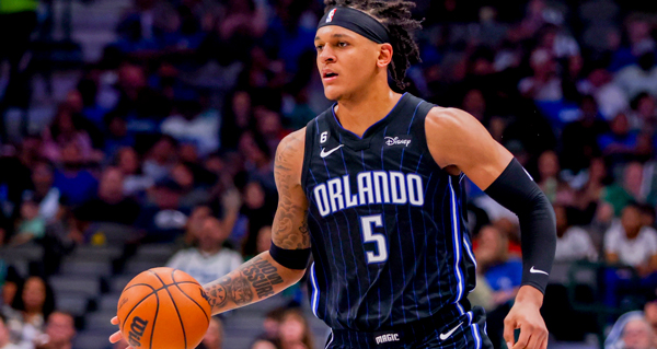
Orlando Magic
Another team that is simply lost when it comes to where to go next. These jerseys do not move them out of the shadow of their originals, which may just have to come back for good, and enjoy the same space as the aforementioned untouchables.
Portland Trail Blazers
The Blazers’ day-to-day wear also exists in this stratosphere of cemented imagery. This newest variant is an acceptably fresh thing, but it isn’t required.
Philadelphia 76ers
Given the fanbase’s notoriously surly demeanor, there is a certain comedy to these “City of Brotherly Love” uniforms, which is of course the core of this clichéd phrase’s endurance. It’s an old joke, but it will entertain again.
Phoenix Suns
Fun, popping colors, and more truly Southwestern than anything the team’s put out before.
Sacramento Kings
The color change-up is fine and not very notable, but the David Stern quote—”We’re going to keep this team in Sacramento”—leaves a lot of questions about what the Kings were trying to convey.
San Antonio Spurs
People clamored for the Spurs to embrace their old, more colorful look for so long that when they finally did, it was mostly too late. This odd font choice, which suggests children’s programming, doesn’t help.
Toronto Raptors
Indistinguishable from previous (successful) efforts.
Washington Wizards
Delightful.
